

Minh-Anh Nguyen
Background
Travelling back to February 2019, I had been working as a researcher for a media company. My job involved lots of data and spreadsheets to store and analyze it. But for such a fast-growing industry with millions of rows of new data flowing in every day, Microsoft Excel was hardly sufficient to get the job done. It could easily take a whole morning just to update a few spreadsheets as the performance of Excel quickly deteriorates when working with large data. I was looking out to learn some new tools for my works and I found a Data Analysis with Python course at CoderSchool. To someone with a business background like me, coding felt like rocket science and it was not something that I thought I would be interested in. Nevertheless, being frustrated with Excel constantly crashing, I gave it a try anyway and OMG, it was mind-blowing. I have been coding since then and now I am teaching at the same school where I learnt my first line of code.
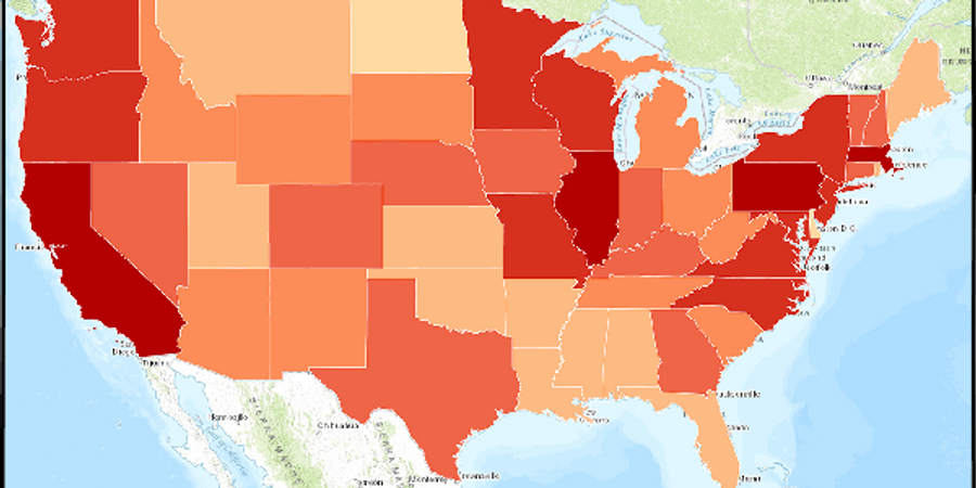
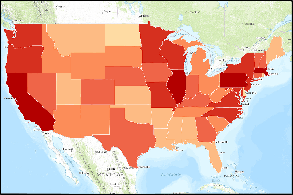
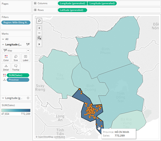
One of the topics that I have been encountering very frequently in my jobs was working with geographical data. Before I knew Python, it was a very challenging task to plot data on a map. One of our options was Tableau and its Map function (Source: Tableau). One limitation of Tableau, however, is that it can only plot data by Provinces in Vietnam, while many of the projects required data to be illustrated by Districts.
In that regard, Python provides much more flexibility and also more customization options when plotting on a map.
Geopandas & Geoplot
Geopandas and Geoplot are two Python libraries that allow us to handle and visualize geographical data. Geopandas is based on pandas and extends its features to allow manipulating geometric data type. Geoplot, similarly, is built on top of matplotlib for cartographic plots. If you are unfamiliar with pandas and matplotlib, I suggest these two articles to get you started:
A Quick Introduction to the “Pandas” Python Library
Data Visualization using Matplotlib
In this example, I will be running the code in a Colab Notebook environment. First, we will need to install Geopandas and Geoplot:
!pip install git+git://github.com/geopandas/geopandas.git!apt install proj-bin libproj-dev libgeos-dev!pip install git+git://github.com/ResidentMario/geoplot.git
Import the necessary libraries:
import pandas as pdimport matplotlib.pyplot as pltimport geopandas as gpdimport geoplot as gpltimport warningswarnings.filterwarnings('ignore')
Geometric data of countries around the world are widely available on the Internet. They come in many different formats, most of which are supported by geopandas. Geometric data of provinces in Vietnam is available on HCMGIS OpenData. In this example, I will use the JSON format. Geopandas has the function read_file to read geometric data from a source. This returns a Geopandas DataFrame containing many columns, but we will only need to care about the Name (District), Province and geometry column.
GEO_URL = 'http://opendata.hcmgis.vn/geoserver/wfs?srsName=EPSG%3A4326&typename=geonode%3Avietnam_districts&outputFormat=json&version=1.0.0&service=WFS&request=GetFeature'geo = gpd.read_file(GEO_URL)# We only need to care about the Name, Province and geometry columngeo = geo[['Name', 'Province', 'geometry']]geo.sample(10)
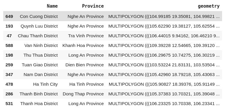
Notice the data in the geometry column: they are in MULTIPOLYGON format, which represents the shape and the location of the district on the world map.
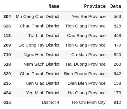
We will also need some data to plot on the map. I have prepared some sample data in the form of a .csv file. It contains the numerical data of some districts in Vietnam and the province they belong to. We can read the file with pandas.
DATA_URL = 'https://raw.githubusercontent.com/minhanhng-cd/generate-geo-map/master/data.csv'data = pd.read_csv(DATA_URL)data.sample(10)
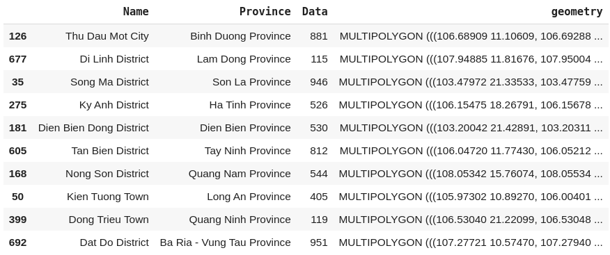
In order to illustrate our example data on the map, we will need to combine it geopandaswith the geometric data. This can be achieved with the method merge.
geodata = geo.merge(data, how='inner', left_on=['Name','Province'], right_on=['Name','Province'])geodata.sample(10)
We can now make a map with geoplot. In this example, I am making a Choropleth map, where the value of our variable Data (hue) is represented by the color of the polygons. Geoplot has more options for map types, check out their Documentation.
gplt.choropleth(geodata, hue = geodata['Data'])

Improving the Plot
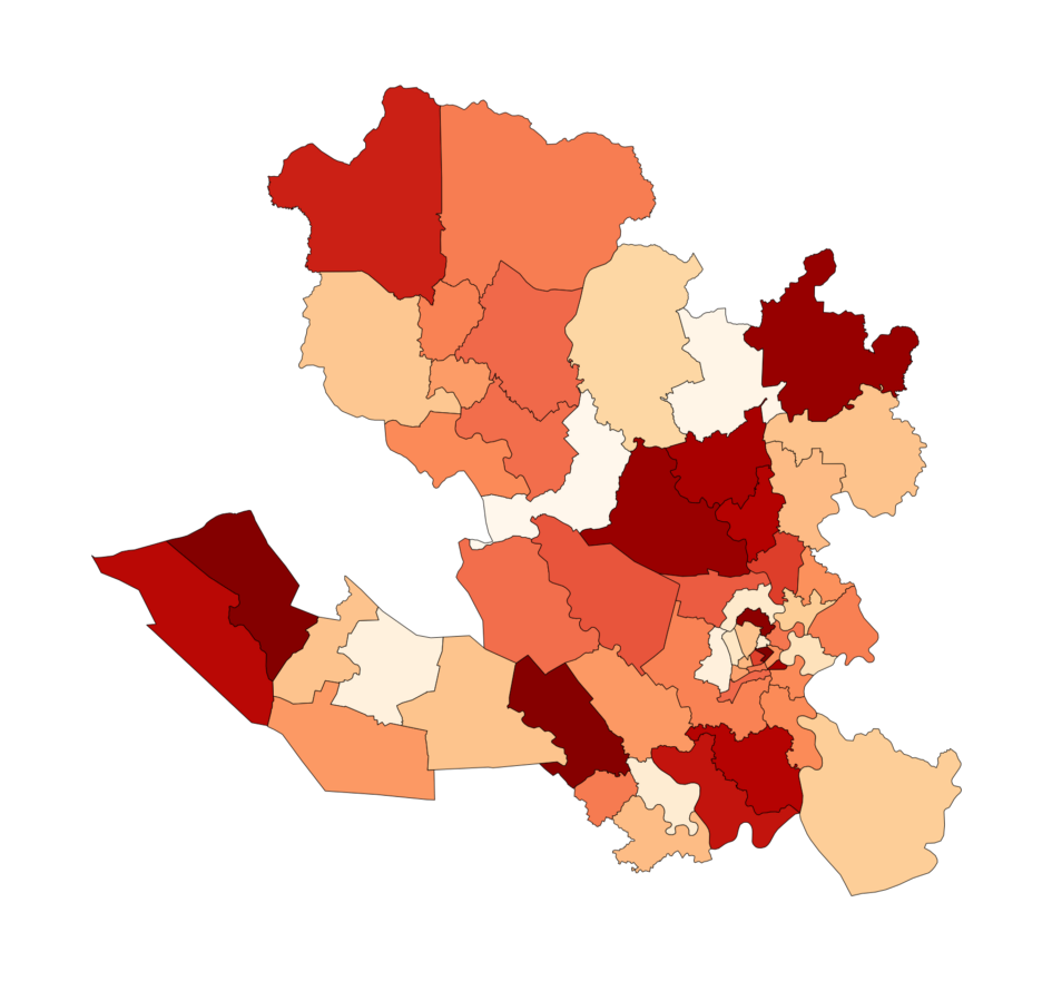
It is probably not a good idea to plot all districts in Vietnam together as there are so many of them. Instead, we can break down the country by region. For example, I can select only four provinces to plot by applying a filter to the DataFrame.
Change the figsize argument to configure the size of the map and cmap for the color palette used for polygons.
plotdata = geodata[geodata['Province'].isin(['Binh Duong Province','Tay Ninh Province','Long An Province','Ho Chi Minh City'])]PALETTE = 'OrRd'gplt.choropleth(plotdata, hue = plotdata['Data'], cmap = PALETTE, figsize = (15,10))
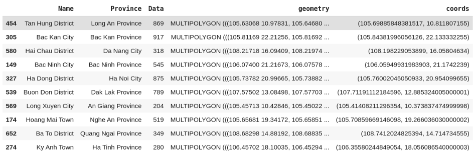
What we often want to do is to add some labels to the plot (i.e. name of the districts and the values of the variable). Since geoplot is built on top of matplotlib, we can do this using the plt.text. However, it requires the position of the label on the plot. The method centroid returns a x-y coordinate of the point in the center the polygon, which is just what we need!
geodata['coords'] = geodata['geometry'].apply(lambda x: x.centroid.coords[:])geodata['coords'] = [coords[0] for coords in geodata['coords']]geodata.sample(10)
Now we can add some labels to the plot with matplotlib.
plotdata = geodata[geodata['Province'].isin(['Binh Duong Province','Tay Ninh Province','Long An Province','Ho Chi Minh City'])]PALETTE = 'OrRd'gplt.choropleth(plotdata, hue = plotdata['Data'], cmap = PALETTE, figsize = (60,30))for _, row in plotdata.iterrows():hue = round(row['Data'],2)plt.text(s=row['Name'], x = row['coords'][0], y = row['coords'][1],horizontalalignment='center', fontdict = {'weight': 'bold', 'size': 8})plt.text(s='Data: ' + f'{hue:,}', x=row['coords'][0],y = row['coords'][1] - 0.01 ,horizontalalignment='center', fontdict = {'size': 8})

Notice those messy text cluster on the lower right corner? It is because the districts in Ho Chi Minh City are too small and their labels are too closed to each other. One solution is to exclude the labels of Ho Chi Minh City’s districts from the map.
plotdata = geodata[geodata['Province'].isin(['Binh Duong Province','Tay Ninh Province','Long An Province','Ho Chi Minh City'])]PALETTE = 'OrRd'EXCLUDE_PROVINCE = ['Ho Chi Minh City']gplt.choropleth(plotdata, hue = plotdata['Data'], cmap = PALETTE, figsize = (60,30))for _, row in plotdata.iterrows():if row['Province'] not in EXCLUDE_PROVINCE:hue = round(row['Data'],2)plt.text(s=row['Name'], x = row['coords'][0], y = row['coords'][1],horizontalalignment='center', fontdict = {'weight': 'bold', 'size': 8})plt.text(s='Data: ' + f'{hue:,}', x=row['coords'][0],y = row['coords'][1] - 0.01 ,horizontalalignment='center', fontdict = {'size': 8})

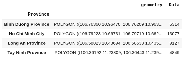
Another very helpful feature of geopandas is to combine multiple polygons together into larger chunks. This is particularly useful when, for example, you want to visualize the data by Provinces instead of Districts. geopandas has the dissolve() function to aggregate Districts data rows into the respective Provinces.
plotdata_province = plotdata.dissolve(by='Province', aggfunc='sum')
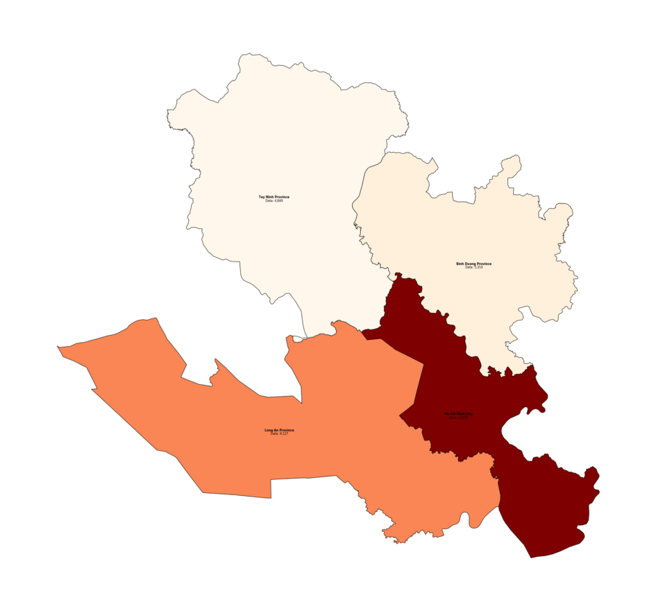
The Provinces are now in the index of the DataFrame, so the code to draw the labels will need small modification.
# We will need to generate the coordinates againplotdata_province['coords'] = plotdata_province['geometry'].apply(lambda x: x.representative_point().coords[:])plotdata_province['coords'] = [coords[0] for coords in plotdata_province['coords']]PALETTE = 'OrRd'gplt.choropleth(plotdata_province, hue = plotdata_province['Data'], cmap = PALETTE, figsize = (60,30))for idx, row in plotdata_province.iterrows():hue = round(row['Data'],2)plt.text(s=idx, x = row['coords'][0], y = row['coords'][1], # The Province names are now in the indexhorizontalalignment='center', fontdict = {'weight': 'bold', 'size': 8})plt.text(s='Data: ' + f'{hue:,}', x=row['coords'][0],y = row['coords'][1] - 0.01 ,horizontalalignment='center', fontdict = {'size': 8})
Conclusion
Geopandas and Geoplot are two very useful Python libraries to visualize geographical data. They require more efforts but also allow much more control over the plot.